

My Daily Nosh
Mobile App Design for a Grocery Ordering Service
Completed for Thinkful's UX/UI Bootcamp
Overview
My Daily Nosh is a grocery ordering app to incorporate technology to simplify everyday practices. Grocery shopping is a task that nearly everyone has to do, and My Daily Nosh strives to make the task easier and more enjoyable for users.
The Problem
It is difficult for people to keep track of what they need to buy at the grocery store.
With incorporating machine learning into the app, the users could find the app inconvenient if the interface doesn't support the habits of their shopping. Assuring that the app will respond to the users shopping habits can ensure they have an easier shopping experience. Without those practices in the app it will complicate the users experience and make them wonder why they didn't just go in store.
My Role
UI design
User and usability testing
Scope
This project was done as a two week sprint, with the given materials being the wireframes, personas, and competitive analysis.

My Tools
Figma
Miro
Maze
User Research
Users not only need food but love to experiment with it. Users for My Daily Nosh can not only shop for their groceries but use it as a simple organizational tool to benefit cooking hobbies. The audience focused on for the project are people who find being creative with food appealing.
 |  |
|---|

Wireframe
From this adapted wireframe I created screens to best test the look and feel of the design.
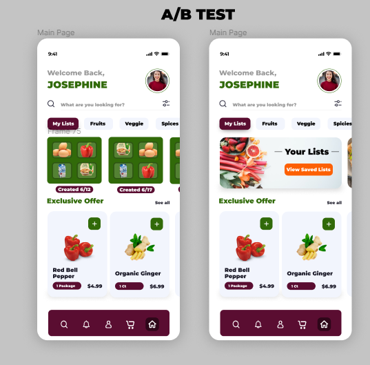
A/B Testing for the Prototype
Prototype Testing
After developing the prototype from the wireframes, I started with A/B testing for different screens.
80%
First A/B Test
Large majority preferred the B of the two options. The first design was a bit more busy and made choosing lists on the app home screen a bit overwhelming.
65%
Second A/B Test
Users preferred to see the quantity adjustment buttons at the bottom right as opposed to the price in that spot.

Usability Testing
After completing this prototype I took it to testing on Maze.
16%
Extremely low mis-click rate when testing each screen
80%
Of users responded positively to the organization of components
From here I was tasked with a visual redesign of the app. I started by setting the mood and tone by creating a mood board.

Mood Board
I wanted the redesign to be fresh and intriguing for shoppers. I feel this redesign helps incorporate the view of the personas aesthetics as well to make this app more desirable.
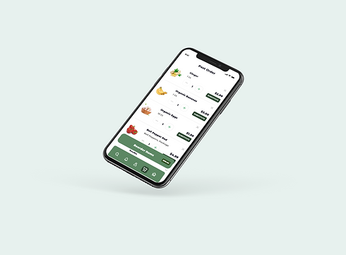
Before and After
After creating the new palette and redesigning the screens with the new palette I prototyped all screens with the new look!
.png)
.png)
.png)
.png)
Accessibility
For testing the accessibility I used tools within Figma to test the contrast of the colors in my palette. I test this to ensure that the colors I'm using in my palette are accessible for anyone viewing the outcome of my designs.
Outcome/ Results/ Next Steps
This is a grocery app that allows for an outlet so much more exciting than just groceries. By allowing specified lists to help promote creativity for the user with new recipes or specific meal planning. This app can help make grocery shopping and meal planning not only easier but also a more fun experience.
Next steps might include including multiple grocery store options as well as a more advanced couponing system.

.png)

.png)
Final Thoughts
This project was very interesting to me as it was not something I am in the target demographic for. I was excited for the opportunity to explore something new! I ended up loving the visual design process here and enjoyed creating the pieces for this project.